I have been talking in analogy for the last few days. The common meme is relating the computing usage trends to that of the car industry. As I watch continue to watch my family use their devices, it does feel like things are changing. My mum continues to thrive on her iPad / Palm Pixi combo. She feels empowered to try the different corners of the experience. To download new experiences. She is having fun.

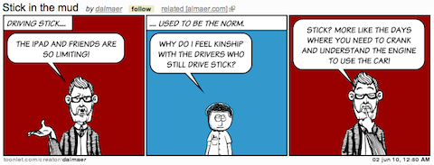
One friend suggested that it is like the shift (pun intended) that we saw when automatic transmissions were introduced. At first they were expensive and had some issues, but being able to have simple controls changed the way that people drove. It became so simple. There were people who cried that it would never take off. “People want the control of a manual stick shift system!” However, although we continue to see some die-hards, the vaste majority of the US population drive automatics (this isn’t true everywhere in the world). That battle is over. We will never go back.
The iPad experience is like driving the computing experience without the manual hassle. You don’t have to know how to install the engine to start out (install an OS), nor deal with (and worry endlessly about) the workings. In general, you just don’t need to worry about all of the abstractions any more. The notion of files. And, don’t get me started on viruses.
As my mother thrives on her iPad, I use it sparingly, mainly as an entertainment consumption device. Wait a minute: Am I am the guy who loves the stick shift and never wants to jump to an automatic? I am a little different from the religious chaps who claimed they couldn’t understand why anyone would want an automatic. Or looked down on those people. I understand why my Mum prefers the iPad experience.
I do find the iPad experience often frustrating however. My “why did the car shift then? it wasn’t time!” moments occur mainly around the restricted access to customization, and the inherent and enforced immersion.
First a small thing, which will unfortunately show off an how anal I can be:

I want to rename this to “BBC News”. I am the guy who winces when someone bookmarks a page and doesn’t rename it, thus having “Foo.com – a barish company that deals in widgets, gadgets, monkeys, and flubbers”. I want to jump in and rename it to “Foo” on the bookmark bar. More space. More room. Petty for sure.
Where it gets more real for me is in the lack of integration between applications. Being immersed with one application at a time can be a fantastic thing, I will give you that… even if I often would love to give a bit of screen real estate to me Twitter stream while working on another app right next to it. However, if you live in an immersive environment, you need great integration between experiences. I should be able to Tweet/Share from any application, and not have to close down the app, go to a Twitter client, and get back to the app that had content I was tweeting. A lot of this comes down to multitasking, but more comes from integration….. and putting intents on a stack. On the iPad I feel like I am jumping through doors without an easy way to go back.
The browser has some of these notions baked in. States have URLs that I can bookmark. I can go forward and back. I can search. I can fork off (new tab). Turns out, I really like those abstractions, and miss them when they are not there, and every single app tries to reproduce some of them. They are often cross cutting concerns. I don’t want the app developer to have to write code and choose where to put a “Share” button. I want the system to know that I have an account on Twitter and let me share with a simple gesture.
Back to the Web. I was a little stunned when a friend showed me the Speed Test.net experience on an iPad:

Yup, if you go to speedtest.net, you are automatically redirected to the App Store. There is no way to trick it (again: would be nice to have customizability and tweak user agents etc).
To the credit of the speed test developers, the website is driven by Flash, which won’t work…. so they are trying to do something good for a user. I get that.
However, I am scared to death to think of the Web going this way. You go to websites and get sent to apps directly. I *do* want user agents to tell me if apps are available (hence the App Discover experiment), but don’t force me into the world of apps. I also think that doing what YouTube does and take over a URL in a certain way can be a good thing. I would love to install handlers for mime types…. so a certain link always opens up my favourite Twitter client say.
I personally prefer many of the Web experiences to the “new” app experiences. (I talked earlier about the abstractions that I find useful). This could break the Web. Data that was shared at the ReadWriteWeb Mobile Summit showed that the same users often hit a site using: mobile website, full website, and application. We are context switching in real-time already. Different views are best for different use cases.
It definitely feels like there is a shift in the force. We need to get the balance spot on as we move to automatic transmissions. What should be customizable. What should be locked down. As developers as well as consumers, we need to make our voices heard. What do you think?
